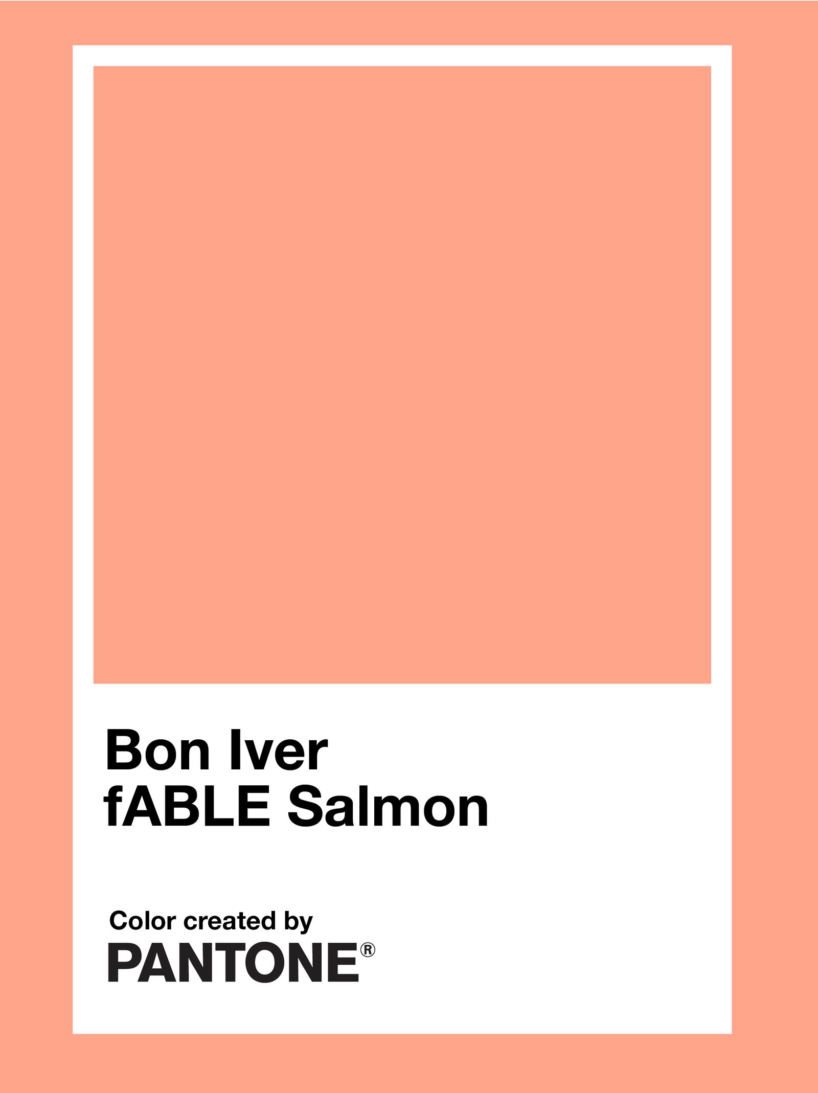
There are two Pantone colors on the covers of Bon Iver’s SABLE, EP and SABLE, fABLE: Black C and 1625 C. The latter now has an official name: fABLE Salmon. Read more about the Bon Iver partnership on the Pantone website, and take a look at the swatch below.
Justin Vernon worked on the art direction for SABLE, and SABLE, fABLE with the Minnesota-based painter Ruben Nusz and Secretly Group’s head of art and design, Miles Johnson.
“It was fun dialing in the specific color to Justin’s vision,” Nusz told writer Andy Battaglia for Pantone. “Many people don’t know that we see color through not only cultural biases but also through the lens of language. Color and language are inseparable. As we adjusted the color temperatures for the salmon (between cool and warm) and the hues that mix to make the color, we were careful not to make the salmon too red, too yellow, or too orange. When a color is more abstract, it’s less pinned down by language—it opens up. As we perfected the color, it came to be defined by two words: Bon Iver.”
Johnson added, “There’s a lot of space [in cover art] that gives you access to a record, but it can also act as a barrier or alter your perception of the music. Justin was very keen here to keep peeling away any layers that might be on top.”
Pantone has partnered with musicians a number of times in the past. There has been Love Symbol #2, in honor of Prince; Pink Noise by Laura Mvula; and Grateful Red and Stealie Blue, for the Grateful Dead. And, while not given an official name by Pantone, you can find the green hue from Charli XCX’s Brat in the catalog as Pantone 3507 C.
